- Pay your bill
- sales@miracleites.in
- 999 001 7953
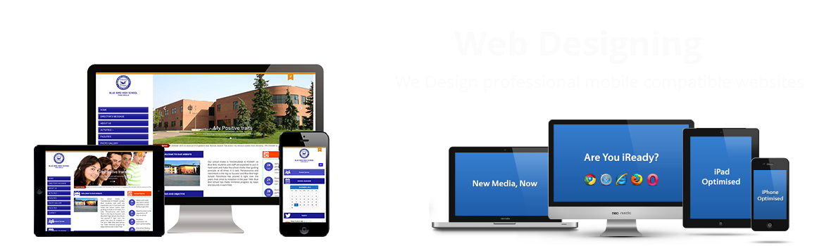
Responsive design
Home / Responsive design
We made design which is an art optimized to meet the objectives an approach to web design which makes web pages render well on a variety of devices and window or screen sizes.
Nowadays, it’s not only important for us to develop our clients' websites to look good on all browsers, and on PC and MAC, it's also a must that websites are viewable on tablets and mobile devices. A lot of people opt for making one version of their site for desktop and another for mobile. Others choose Responsive Design, a mix of fluid grids and layouts, flexible images and an intelligent use of CSS media queries.There are quite a few sites dedicated to lending a hand with responsive grids, Grid Pak, CSSGrid, Skeleton and Simple Grid.